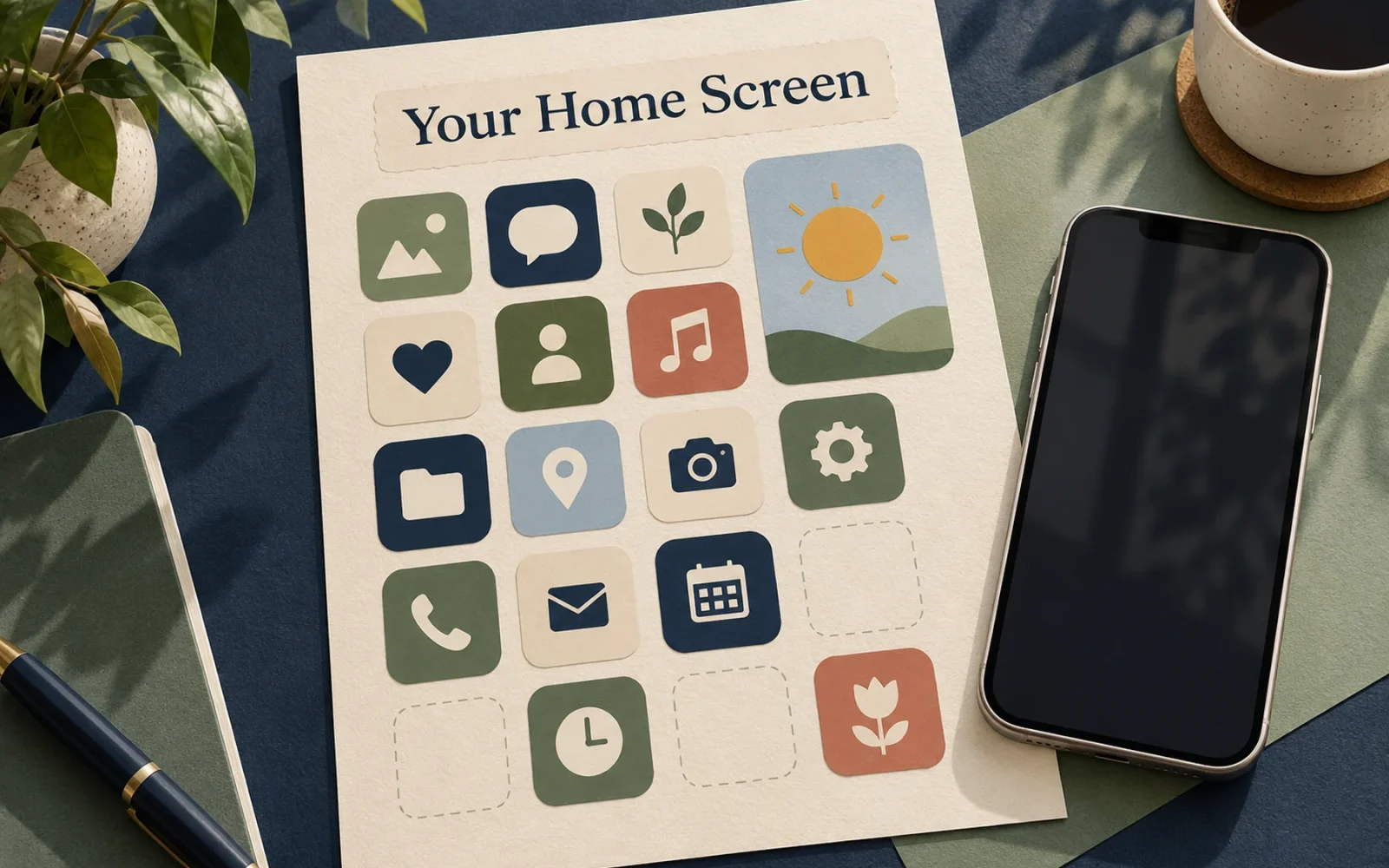
In iOS 18, press and hold an empty area of the Home Screen, tap Edit, then Customize to change icon size and choose Light, Dark, Automatic, or Tinted icons. To move an app, keep the Home Screen in editing mode and drag it to an available grid position. You can leave gaps instead of filling every position from the top.
Start with the arrangement you need, then adjust appearance. A color theme is easier to live with when the apps you use daily are still easy to recognize and reach.
Arrange the useful apps before changing the theme
Press and hold the background until the apps jiggle. Drag an app to a new position, or toward the screen edge to move it to another page. Finish editing with Done or the equivalent completion control shown on your phone.
Use the lower rows for apps you regularly open with one hand. Keep occasional apps on another page or in the App Library rather than crowding the first screen. A blank area can also preserve a useful part of your wallpaper without moving every app to another page.
Movement still follows the Home Screen grid. The ability to leave spaces is not unrestricted placement at any pixel. If an app moves beside another icon rather than exactly where your finger stops, adjust the grid position instead of assuming the feature failed.
Change icon size, darkness, and tint
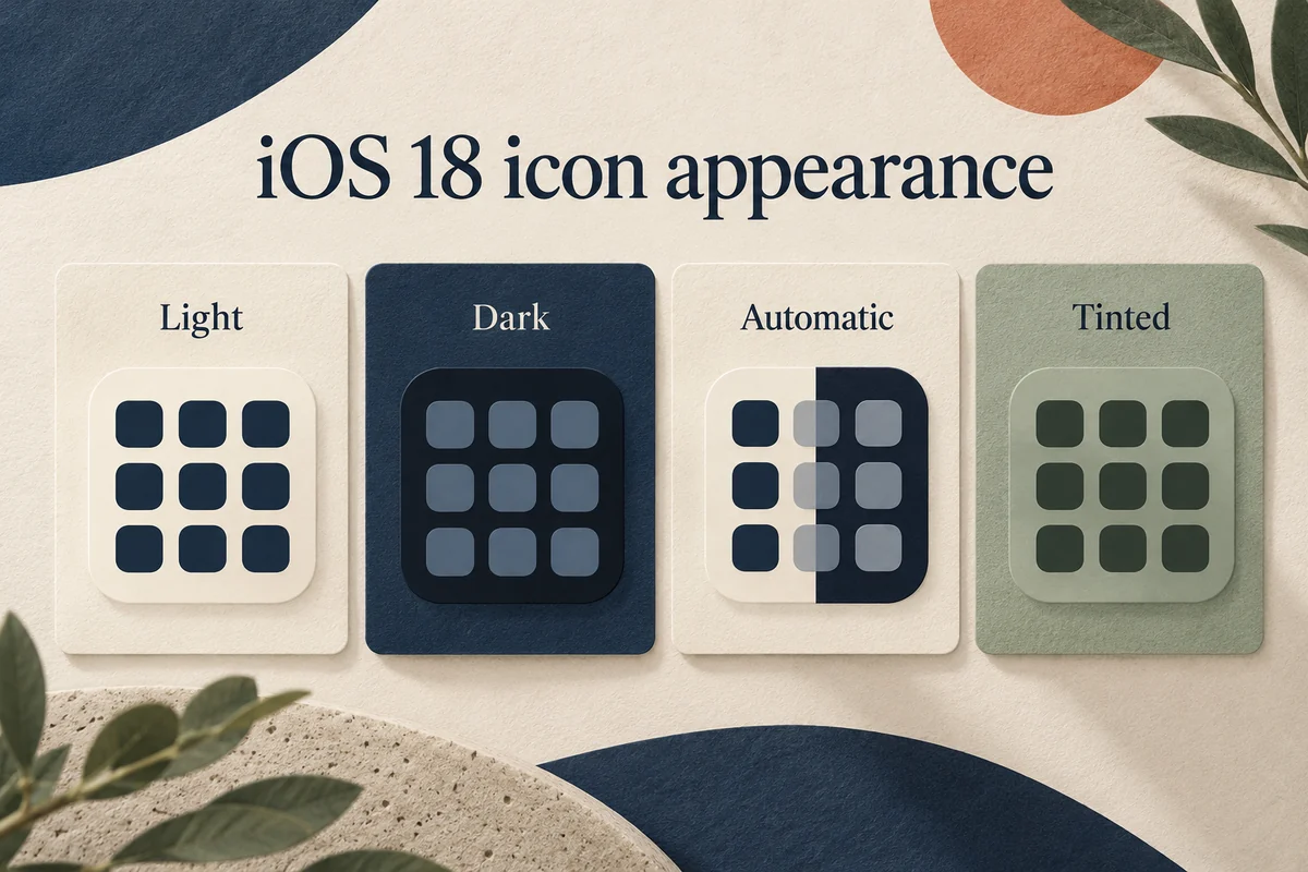
Hold the Home Screen background, choose Edit, then Customize. Apple’s iOS 18 customization guide describes the available controls.
| Choice | What changes |
|---|---|
| Small | Standard icon size with app names |
| Large | Larger icons without the usual name labels |
| Light or Dark | The selected supported icon appearance |
| Automatic | Appearance follows the system’s light or dark setting |
| Tinted | Applies a chosen color treatment to icons and widgets |
For Tinted, adjust the color controls and preview several different apps before leaving the editor. The eyedropper can help coordinate a tint with the wallpaper. Choose enough contrast that a familiar icon remains identifiable at a glance.
If your priority is readability, try Small with visible app names before committing to Large. Larger graphics are not automatically easier when removing labels makes several similarly colored icons difficult to distinguish.
Add widgets that earn their space
To add a widget, hold the background, open Edit, and choose Add Widget. Select the app and one of its supported widget sizes, then place it where you want it. Apple’s widget guide covers the available placement controls.
A useful widget saves an action: the next appointment, current weather, or a frequently checked reminder. A widget that merely repeats information you never use occupies space without helping the layout.
Test the size before rearranging the entire page around it. A wide widget can displace icons into another row or page. If the screen becomes harder to scan, reduce the widget size or move it to a secondary page.
Know the limits of built-in icon customization
Tinting changes appearance; it does not replace each app’s underlying logo with an individually selected picture. Dark icons likewise depend on the appearance the app supports. A mixed result does not necessarily mean your settings were ignored.
This guide describes iOS 18. Later systems add different visual options, so a tutorial showing controls absent from the iOS 18 editor may be using another version. Check Settings, General, About before searching for a newer effect on an older installation.
If the result is hard to use, return to Customize and choose a standard appearance or Small icons. Move a few apps back rather than immediately resetting the entire layout. A reversible change is easier to evaluate when you alter one thing at a time.
Conclusion
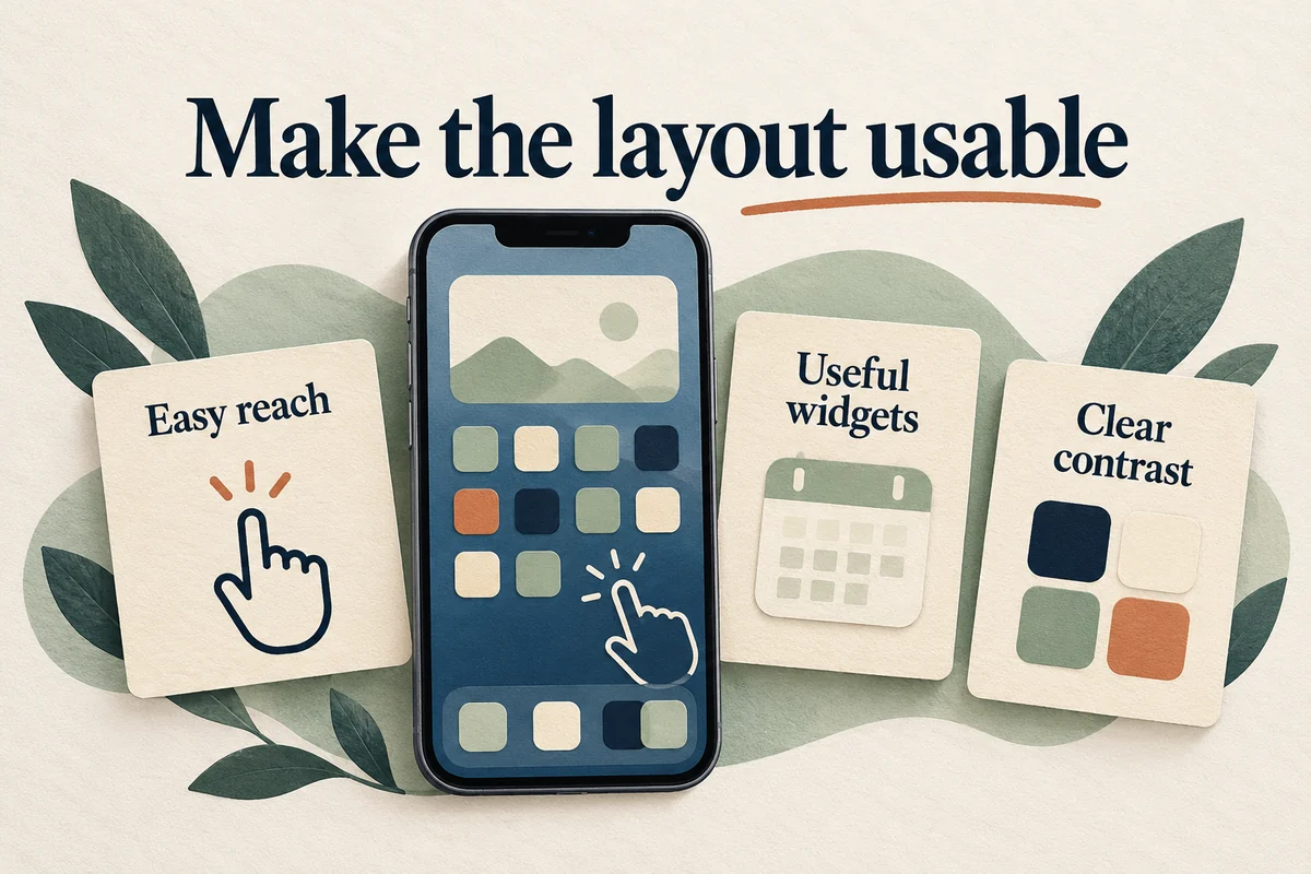
Build the page around the tasks you repeat: reachable apps, useful widgets, and enough contrast to recognize both. Use tint and size to support that arrangement. A successful Home Screen reduces searching, even if its best design is simpler than the theme you originally planned.

Ethan Miller
Ethan Miller writes about home improvement, interior design, cleaning, and everyday living at Home & Living Daily. He shares practical tips and simple ideas to help readers create more comfortable and functional homes.