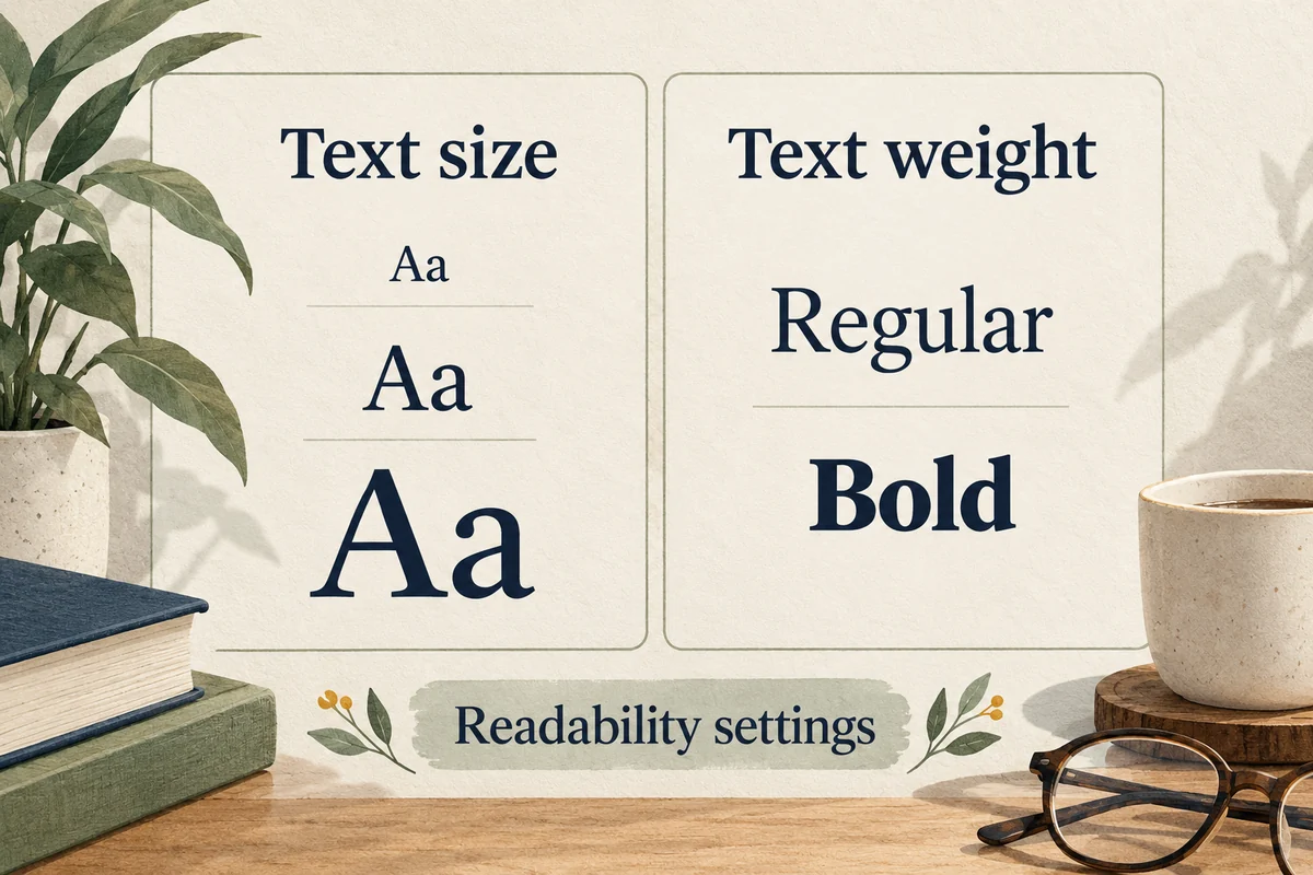
To make iPhone text larger, open Settings, Display & Brightness, Text Size and move the slider. For a larger range, use Settings, Accessibility, Display & Text Size, Larger Text. You can also enable Bold Text to improve weight and contrast. These controls change readability; they do not replace the system font with an arbitrary typeface.
If you want a different font inside a document, use that app’s formatting options. Installing a font for supported apps is a separate task from changing the appearance of iOS itself.
Make everyday text easier to read
Start with Text Size in Display & Brightness and choose a modest increase. Then open the apps where reading is difficult: Mail, Messages, a browser, or your most-used work app. The preview in Settings is helpful, but the real test is a screen you read frequently.
Apple’s text-size instructions explain the standard and larger accessibility ranges. Dynamic Type-aware apps respond to these preferences, while some apps manage their own text or page formatting.
If a size increase makes buttons or lines feel crowded, try Bold Text before pushing the slider further. Use the setting that improves recognition without causing unnecessary scrolling. A person reading short message previews may prefer a different balance from someone reading long articles.
Use the larger accessibility range when needed
Open Settings, Accessibility, Display & Text Size, then Larger Text. Enable Larger Accessibility Sizes if shown and adjust the slider. Return to a real message or article to evaluate it.
Check more than one app before deciding the setting is broken. If text grows in Mail but not inside a scanned PDF, the PDF may contain a page image rather than adaptable text. Zooming that page is a different operation from increasing a font setting.
Likewise, a website can have its own layout constraints or browser text controls. Avoid repeatedly enlarging every system label to fix one poorly formatted page. Identify whether the problem is system text, one app, or one document first.
Change a typeface inside a supported app
Document editors, presentation apps, and some design tools let you select a font for selected text. Open the app’s formatting controls and choose from its available fonts. That change applies to the document or text selection, not to Settings, notifications, or every app on the phone.
Apple’s font-installation guide explains that fonts installed through supported font apps can be managed in Settings, General, Fonts. Their usefulness depends on whether your editing app supports them.
Before installing anything, check the app you intend to use. It may already include an appropriate font, or it may not support added fonts at all. A font download cannot force an unrelated app to adopt that typeface.
Avoid confusing fonts with keyboards and special characters
Some “font keyboard” apps create stylized Unicode characters rather than applying a normal font to ordinary text. Those characters may look decorative in a social profile, but they can behave differently in search, copying, accessibility tools, or another person’s app.
For important information such as a contact name, address, or form entry, ordinary text is usually easier to recognize and reuse. If your goal is simply a more readable phone, a decorative keyboard does not address the size or weight of the interface.
Also distinguish a Lock Screen clock style from the general system typeface. Customizing one clock does not change the font in Mail. Start from the place where you want the result to appear instead of assuming there is one global “font” switch.
Conclusion
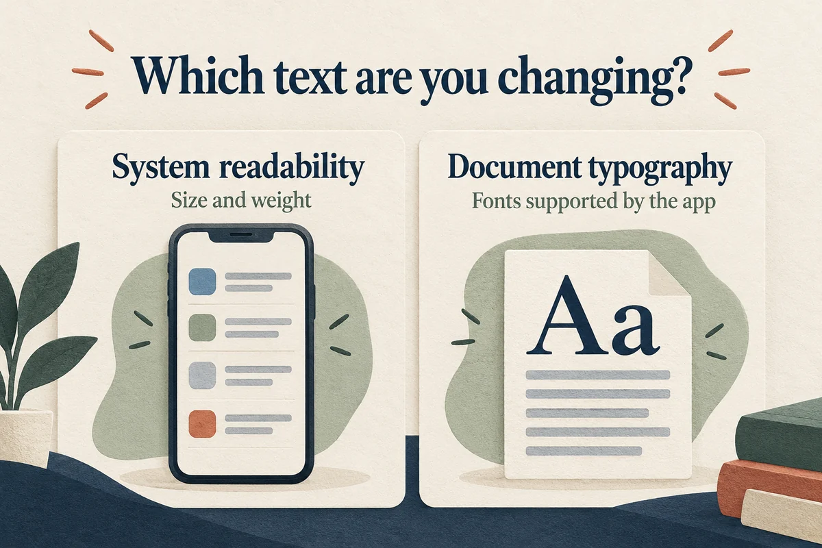
Use system text size and weight for readability, and an app’s formatting controls for document typography. Check the actual screen you struggle with before adding fonts or changing several settings. That keeps a small reading problem from becoming a phone-wide redesign that does not solve it.

Ethan Miller
Ethan Miller writes about home improvement, interior design, cleaning, and everyday living at Home & Living Daily. He shares practical tips and simple ideas to help readers create more comfortable and functional homes.