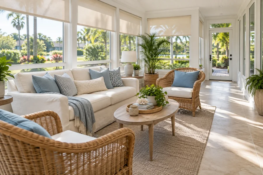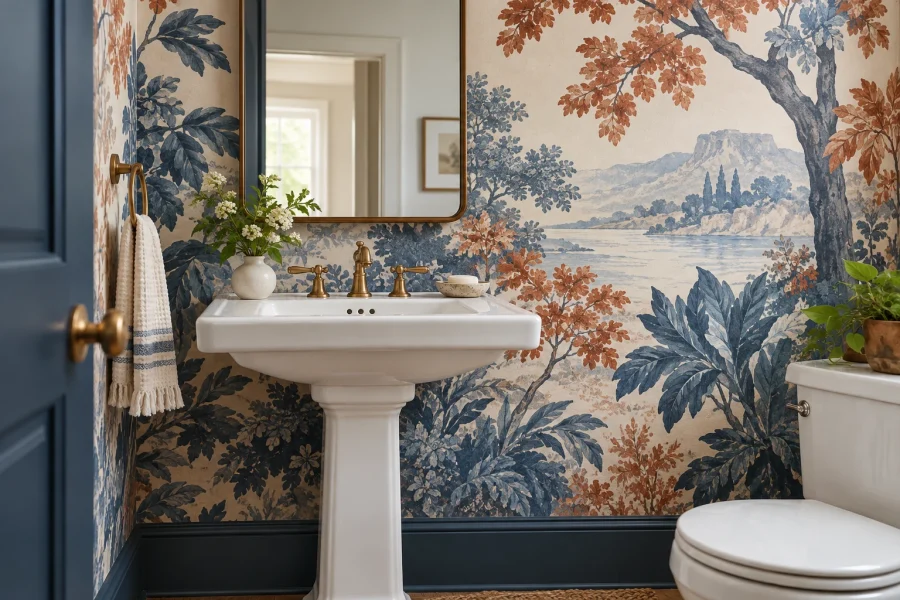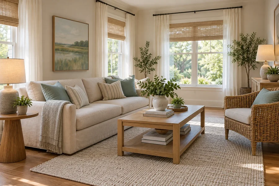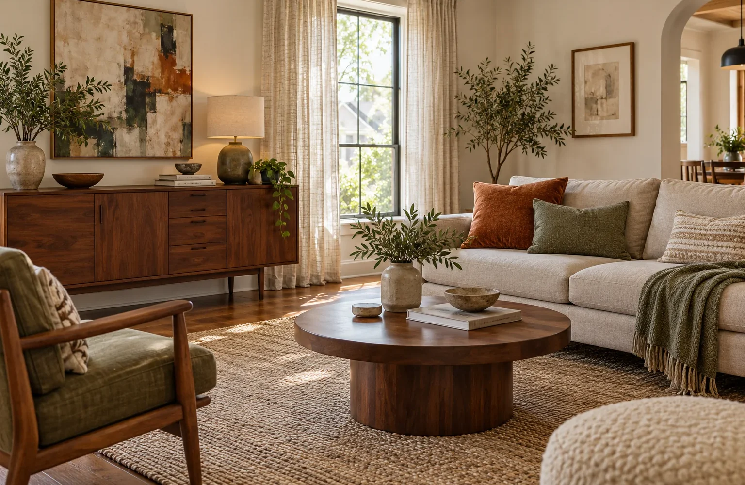
The current home decor trends for 2026 favor warmer color, tactile materials, vintage character, softer shapes, and more personal rooms. The useful takeaway is to add a layer that makes your existing home feel better—not to replace everything with this year’s look.
As of October 2026, those directions appear in both designer surveys and newer US trend reporting. Below, each trend comes with a small way to try it and a reason to stop before spending more. Choose one that suits your room, your maintenance habits, and the pieces you want to keep.
Editorial review: October 13, 2026. Images are AI-generated decorating concepts, not photographs of completed projects.
What the 2026 Trend Reports Actually Tell Us
Houzz’s September 2026 US fall report, based on interviews with nearly 50 home design professionals, describes warmer, more collected interiors and an interest in materials with character. It is a timely professional perspective, not a count of how every American household decorates.
Earlier evidence points in a similar direction. The 1stDibs 2026 designer survey highlights chocolate brown, vintage pieces, and expressive interiors. Its 468 respondents were design professionals worldwide, surveyed in July and August 2025; those answers are forecasts and designer preferences, not US consumer purchasing data.
Use the reports as a menu of possibilities. If your actual goal is fixing a layout or choosing a rug, start with our evergreen home decor ideas for practical room updates. A trend is most useful when it helps solve a problem you already have.
1. Warm Color, Used in Manageable Doses
Chocolate, rust, cream, and muted green feature in Houzz’s 2026 emerging summer trends report. That report measures year-over-year growth in US searches on Houzz during January–March, so it signals interest on the platform rather than a nationwide popularity ranking.
Try it: Keep the sofa and start with one textile. Hold a brown or burgundy pillow against the upholstery, flooring, and curtains, then check it under the lamps you use at night. If the room already contains warm oak and beige, a muted green or blue accent may offer more useful contrast than adding another brown.
A small color change still needs a connection. Repeat the accent once in an artwork or an object you own, instead of buying several matching accessories. In a rental, bedding and removable cushion covers make this experiment easy to reverse.
Stop here if: The new color makes your existing rug or sofa look wrong to you. Try a different shade or smaller dose before deciding that the expensive piece needs replacing. A gray sofa can remain part of a warm room.
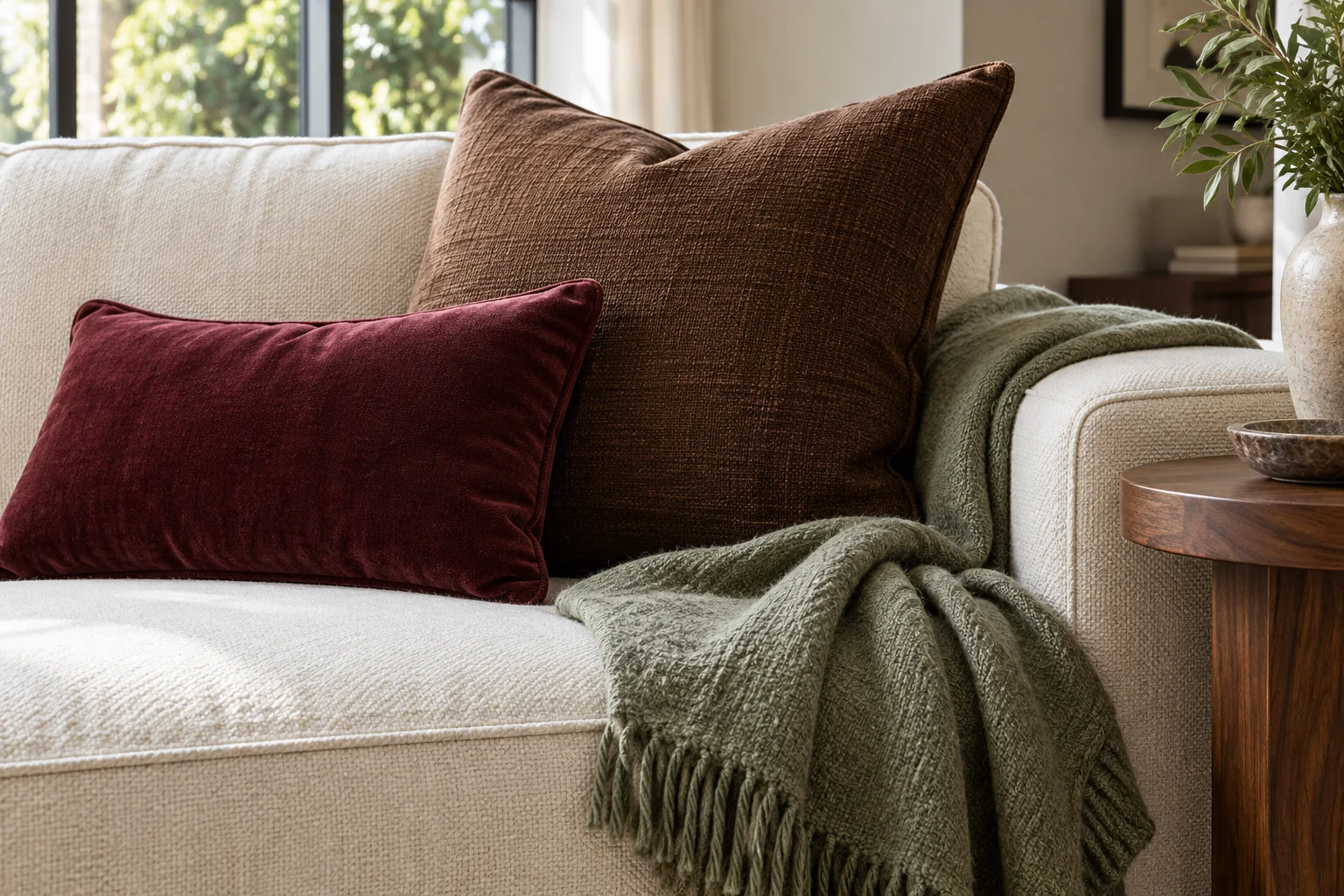
2. Texture That Comes From Contrast
Tactile surfaces are another direction identified in Houzz’s summer report, including interest in textured wall finishes. You can explore the visual idea without committing to a specialist finish or a room full of delicate materials.
Try it: Choose one smooth surface, one soft textile, and one more visibly textured item. A wood table, linen curtain, and matte ceramic bowl create an easy comparison. If your room already has woven furniture and a thick rug, a plain tray or smooth lamp base may be the missing element.
Look at the materials from the doorway as well as close up. Several similar beige textures can disappear into one another; differences in scale and finish give the eye something to notice. Leave part of the table or shelf bare so the contrast remains visible.
Stop here if: Every new layer adds a chore you dislike. Check care labels and the maker’s cleaning guidance before buying. A washable throw may be a better fit than an intricate woven piece in a room where snacks, pets, and everyday spills are normal.
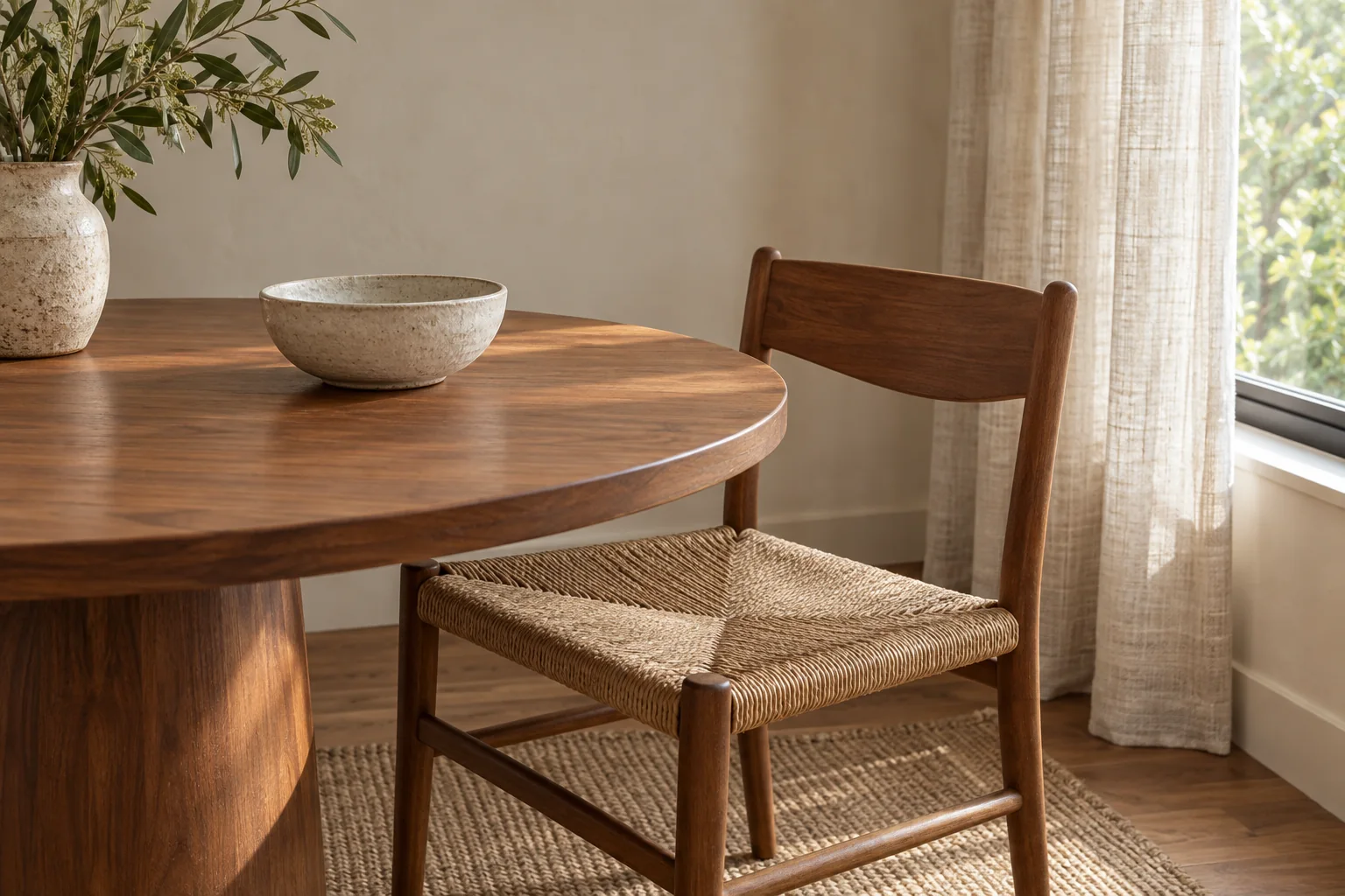
3. Vintage Character Alongside the Furniture You Own
Collected rooms and materials that show character are prominent in Houzz’s fall report. Darker wood also stands out in Apartment Therapy’s 2026 survey of 140 designers. Neither is a reason to replace every pale wood piece or buy a complete antique suite.
Try it: Introduce one older piece with a job: a chest that stores linens, a side table that holds a reading lamp, or a frame for art you already love. Measure the intended spot and the route into your home before shopping. Check drawers, joints, surface condition, and any repair cost before treating a low asking price as a bargain.
Connect old and new through one visible detail. A curved chair arm might echo a rounded drawer pull; a walnut frame might relate to a darker chest. The woods do not need to be identical, but placing actual samples or photographs together can reveal a combination you dislike before you commit.
Stop here if: The piece creates clutter or requires restoration you cannot take on. Personal character can come from your own photographs, a handmade bowl, or an inherited textile. It does not depend on a valuable antique.
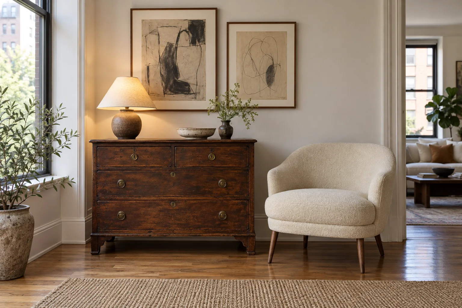
4. Curves as an Accent, Not a Whole Furniture Plan
Rounded furniture remains visible in the 1stDibs survey and Apartment Therapy’s designer preferences. A curved silhouette can break up a room dominated by rectangles, but its appeal on a screen tells you little about how it will fit your floor plan.
Try it: Test a circular tray, rounded lampshade, or oval mirror before considering a sofa. If you already need a coffee table, compare a round or oval option with a rectangular one using paper templates on the floor. Sit in each seat and check whether you can reach the surface comfortably.
A shape change should also work from the doorway. A curved sofa can occupy more usable depth than expected, while a round table may offer less surface for books and drinks than the piece it replaces. Check dimensions rather than relying on the label “small-space.”
Stop here if: The curve reduces useful seating or narrows your usual route. Keep the straight sofa and repeat the softer shape in a smaller object. Our guide to interior design styles can help distinguish a shape you enjoy from an entire style you may not want.
5. Expressive Pattern or Color, With a Clear Focal Point
Apartment Therapy’s designer survey includes patterned wallpaper and color drenching, while the 1stDibs findings also point to floral motifs. These are different ways of adding expression; you do not have to combine them.
Try it: For pattern, place one floral quilt or patterned cushion in an otherwise quiet area. Pull a color from that item into a nearby plain textile or frame. For a stronger painted scheme, test large samples before committing to color drenching—using one color across walls, trim, and often the ceiling.
Judge the room at the times you actually occupy it. An appealing afternoon color may feel too intense when the curtains are closed. If you rent or are uncertain about repainting, a large textile or framed print provides a more reversible focal point.
Stop here if: Several patterns compete for your attention and you no longer like the room from the doorway. Remove one layer and reassess. You can enjoy an expressive room with plain walls, and you can enjoy a quiet room without being behind the times.
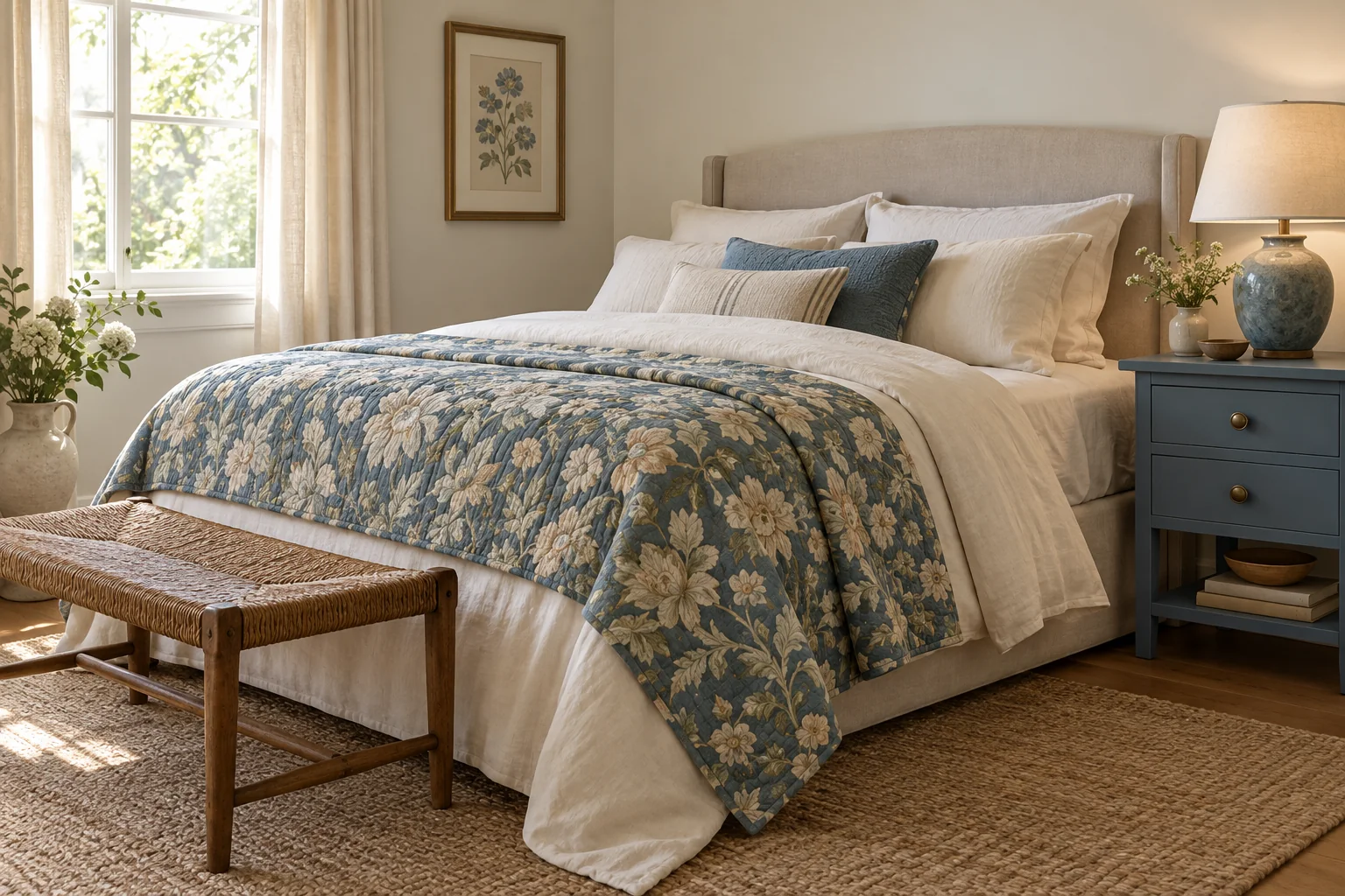
6. Corners for Reading, Games, and Everyday Rituals
Houzz’s summer search report also identifies growing interest in spaces for reading and tabletop games. Translating that direction into an ordinary home does not require a dedicated library or game room.
Try it: Give an existing chair a reachable lamp and a surface for a book. Keep a favorite board game in a nearby cabinet so the dining table can serve another purpose after dinner. Style around the activity instead of adding props that nobody uses.
Try the arrangement for a week. If no one chooses the chair, ask whether it lacks light, comfort, privacy, or a convenient place to put a drink. Move existing furniture first. A successful reading corner is one someone reads in.
Stop here if: The setup blocks storage or turns a working dining table into a permanent display. Make the ritual easy to set up and put away; the room still has to do its other jobs.
Choose One Update That Fits Your Room
This is an editorial decision aid, not a ranking of trends or a cost estimate. Start with the row that describes your room and test the smallest change first.
| What feels missing? | First experiment | Keep for now |
|---|---|---|
| Color in a neutral room | One deeper-toned textile beside the existing sofa | Sofa, rug, and flooring |
| Interest in a flat-looking corner | Contrast a smooth surface with a woven or matte item | Walls and main furniture |
| Personal character | Display meaningful art or add one useful vintage piece | Functional modern pieces |
| Relief from boxy shapes | Try a round tray or lamp silhouette | Large seating that fits well |
| A stronger focal point | One patterned quilt or larger artwork | Other patterns until you reassess |
| A place to unwind | Rearrange a chair, lamp, and side surface | The rest of the room’s layout |
An Example: Refreshing a Gray-Sofa Living Room
Imagine a room with a comfortable gray sofa, oak floor, white walls, and black lamps. Keep those pieces. First, test a muted burgundy cushion beside the gray; if it feels too sharp, try a softer brown or a blue-green instead. Next, move a wood-framed picture from another room into the seating area. Finally, replace a crowded collection of small decorations with one useful tray.
That is enough for a first pass. Live with it before buying a new rug or repainting. This hypothetical example combines color, material, and personal character, but its success depends on your room—not on how many trend categories it checks off.
What Should You Keep Even If It Is Not Trending?
Keep furniture that is comfortable, sound, and correctly sized. Keep finishes you enjoy maintaining. Keep meaningful objects even when they do not match an inspiration photo. A change deserves more scrutiny when it is expensive, hard to reverse, or likely to create a second purchase to make the first one work.
Before ordering, write down three things: what stays, what improves, and what you will spend in total, including delivery or alterations. Photograph the proposed combination and leave it overnight. If the only reason for a purchase is that it looks current, give yourself more time.
The strongest way to use 2026’s decorating ideas is to make one part of your home more enjoyable. Start with a reversible change, keep what already works, and let the room develop at a pace you can live with.
Source note: This guide separates reported design directions from Home and Living Daily’s practical suggestions. Surveys represent their stated respondent groups; platform searches measure interest rather than purchases. Review planned for January 2027 or when substantive new US reporting changes the picture.

Ethan Miller
Ethan Miller writes about home improvement, interior design, cleaning, and everyday living at Home & Living Daily. He shares practical tips and simple ideas to help readers create more comfortable and functional homes.