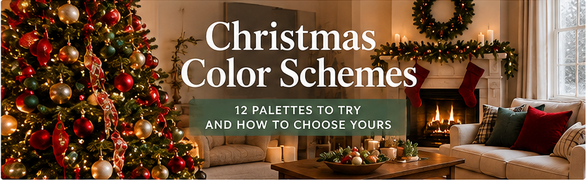
Choosing a Christmas color scheme is less about finding a pretty palette and more about finding one that works with the room you already have. Red and green still anchor many homes, but plenty of households now build their holiday look around white and silver, navy and gold, soft neutrals, or muted sage and blush instead. This guide walks through 12 Christmas color schemes, each with a hex-code palette, a simple 60-30-10 split, material pairings, and the one trade-off worth knowing before you buy. It also covers how to choose between them based on your walls, floors, and furniture, where to apply the scheme (tree, mantel, table, front door), and the mistakes that most often make a decorated room feel busy.
Christmas Color Schemes at a Glance
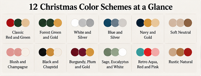
Use this table to find the direction that fits your home, then read the fuller section below. The hex codes are starting points for matching ribbon, ornaments, and printed materials, not paint-brand matches; real products shift under different lighting.
| Scheme | Core Colors | Mood | Works Best With |
| Classic Red and Green | Cranberry, pine, cream | Traditional, warm | Wood floors, warm-toned rooms |
| Forest Green and Gold | Deep green, brass, ivory | Rich, formal | Dark wood, traditional furniture |
| White and Silver Winter | White, silver, pale gray | Crisp, snowy | Light, cool-toned rooms |
| Blue and Silver | Icy blue, silver, white | Cool, calm | Gray or white walls |
| Navy and Gold | Navy, gold, cream | Polished, elegant | Neutral rooms with warm metals |
| Soft Neutral | Oat, cream, natural wood | Quiet, organic | Minimal or Scandinavian rooms |
| Blush and Champagne | Blush pink, champagne, ivory | Soft, romantic | Light rooms, whites and creams |
| Black and Gold | Black, gold, white | Dramatic, modern | High-contrast, modern interiors |
| Burgundy, Plum and Gold | Burgundy, plum, antique gold | Moody, luxurious | Dark walls, velvet, deep tones |
| Sage, Eucalyptus and White | Sage, eucalyptus, white | Fresh, understated | Natural light, plants, wood |
| Retro Aqua, Red and Pink | Aqua, tomato red, pink | Playful, nostalgic | Mid-century or eclectic rooms |
| Rustic Natural | Kraft, pine, buffalo-check red | Cozy, lodge-like | Farmhouse, cabins, wood-heavy rooms |
What Are the Traditional Christmas Colors?
The colors most often called traditional are red, green, white, gold, and silver. Red and green carry the strongest holiday association, with green often linked to evergreen trees and red to berries and festive trim. White, gold, and silver typically play supporting roles as snow, candlelight, and sparkle.
There is no single official list of Christmas colors, and no agreed order for them. If you see a “12 Christmas colors in order” list, treat it as one publisher’s grouping rather than a rule. For decorating, what matters more is choosing a small group of colors and repeating them with intent.
12 Christmas Color Schemes to Try
Each palette below uses a rough 60-30-10 split: about 60 percent main color, 30 percent secondary, and 10 percent accent. Treat it as a guide, not a formula.
1. Classic Red and Green
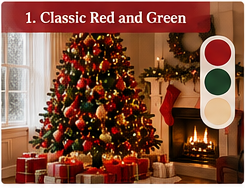
Palette: Cranberry red #9B1B30, pine green #1F4D3A, cream #F5EEDC, warm gold #C9A24B
The familiar look works best when the red leans deep and the green leans dark, which reads richer than bright primary shades. Try 60 percent green (tree, garland), 30 percent red (ribbon, stockings), 10 percent gold. Velvet, plaid wool, and natural wood suit it well. Watch out: pure bright red against bright green can feel harsh, so cream or wood tones between them calm the contrast.
2. Forest Green and Gold
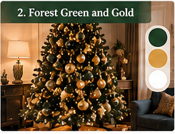
Palette: Forest green #17372B, brass gold #B8923A, ivory #F8F3E6, deep brown #4A3427
Dropping red entirely gives a more formal, library-like feeling. Use green as the dominant tone, gold for ornaments and ribbon, and ivory for breathing room. It pairs naturally with dark wood and leather. Watch out: gold finishes vary from yellow to antique, so choose one gold tone and stay with it.
3. White and Silver Winter
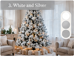
Palette: Snow white #FFFFFF, soft silver #C0C4C8, pale gray #E3E6E8, evergreen accent #2F5D50
A flocked or white-lit tree with silver ornaments creates a snowy, bright look, especially in rooms with plenty of daylight. Add texture through faux fur, knit throws, and mercury glass so the palette doesn’t look flat. Watch out: an all-white scheme can wash out in a white room, so one dark or green element helps it read as intentional.
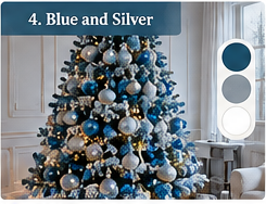
4. Blue and Silver
Palette: Icy blue #A9CBE0, slate blue #4F6D8A, silver #BFC3C7, white #FFFFFF
Cool blues feel calm and wintry rather than traditional. Layer light and mid blues with silver and white, and use glass or mirrored ornaments for shine. It suits gray or white walls and cool lighting. Watch out: in warm, yellow-lit rooms, blues can turn dull, so check samples in evening light.
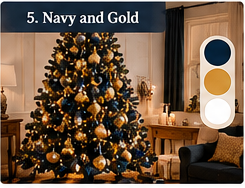
5. Navy and Gold
Palette: Navy #1B2A4A, antique gold #C2A15A, cream #F4EEDD, soft white #FAFAF5
Navy acts as a deeper, more modern stand-in for green. Try navy ribbon and ornaments on a green or white tree, with gold accents and cream linens. Watch out: navy can look nearly black in low light, so keep lighter cream and gold nearby for contrast.
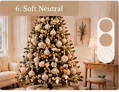
6. Soft Neutral
Palette: Oat #E6D8C3, cream #F3ECDD, natural wood #B58B5F, warm gray #A79F94
A neutral scheme relies on texture instead of color: wood beads, linen bows, woven baskets, dried orange slices, and paper stars. It fits minimal and Scandinavian interiors and is easy to keep up past the holidays. Watch out: with few colors, repeated shapes and varied materials do the work, or the tree can look flat.
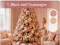
7. Blush and Champagne
Palette: Blush pink #F0CFCB, champagne #E7D3B0, ivory #FAF4EA, muted rose #C98D90
Soft pink with champagne gold feels gentle and a little romantic. Keep the pink dusty rather than bright, and use pearls, satin ribbon, and glass ornaments. It suits light, airy rooms. Watch out: very sweet palettes can feel juvenile unless one deeper tone, such as muted rose or green, grounds them.
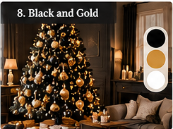
8. Black and Gold
Palette: Black #1A1A1A, gold #C9A24B, white #FFFFFF, charcoal #3B3B3B
High contrast creates a bold, modern look. Black ribbon, matte black ornaments, and gold accents work on a green tree or a white one. Use white to prevent the scheme from reading heavy. Watch out: matte black absorbs light, so add shiny gold and string lights.
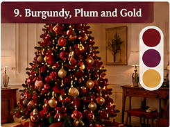
9. Burgundy, Plum and Gold
Palette: Burgundy #6D1F2F, plum #4B2A4A, antique gold #B8923A, blush cream #F1E2D8
Deep wine tones feel moody and luxurious, especially with velvet and dark walls. Layer burgundy and plum together and let gold bring light. Watch out: two deep colors in one dim room can feel heavy; add cream or lighter metallics for lift.
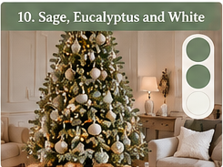
10. Sage, Eucalyptus and White
Palette: Sage #9CAF98, eucalyptus #6F8F82, white #FFFFFF, natural wood #B58B5F
Muted greens create a fresh, understated look that pairs well with real or faux eucalyptus, wood ornaments, and white lights. It works nicely in rooms with houseplants and natural light. Watch out: grayed greens can disappear against a green tree, so use them on a white or neutral tree or on garlands and tabletop styling.
11. Retro Aqua, Red and Pink
Palette: Aqua #6EC6C0, tomato red #D9472B, pink #EFA3B8, cream #F8F1E3
This mid-century-inspired mix brings vintage-style glass ornaments, tinsel, and kitschy shapes. It suits playful or eclectic interiors. Watch out: with several bright colors, keep one dominant (often cream or aqua) so it doesn’t tip into clutter.
12. Rustic Natural
Palette: Kraft brown #B8956A, pine #2F4A37, buffalo-check red #A12A2A, cream #F2EAD9
Plaid ribbon, burlap or twine, pinecones, and wood slices create a cozy cabin feel. It fits farmhouse and wood-heavy rooms. Watch out: too many rustic props at once can feel themed rather than styled, so choose two or three materials and repeat them.
How to Choose a Christmas Color Scheme for Your Home

Start With What Isn’t Changing
Your walls, flooring, sofa, and curtains are fixed, so choose a scheme that sits comfortably beside them. Warm wood floors and cream walls usually welcome red, green, gold, and rustic palettes. Cool gray walls often suit blue, silver, and white schemes better.
Decide Warm or Cool
Gold, brass, cream, and wood read warm; silver, icy blue, and pure white read cool. Mixing is possible, but pick one side to lead. A tree with silver ornaments in a room full of warm brass can look mismatched.
Consider the Size and Light of the Room
In small or darker rooms, lighter palettes (white, neutral, sage, blush) usually keep the space open. Larger or brighter rooms can handle deep tones like burgundy, navy, and black.
Limit Yourself to Three Colors Plus One Metal
A tight palette tends to look planned. Choose three colors and one metal finish, then use the 60-30-10 split to decide how much of each goes where.
Look at the Whole Room, Not Just the Tree
Imagine the tree, mantel, table, and front door together. Repeating one or two colors across them ties the home together without everything matching exactly.
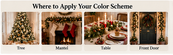
Where to Use Your Color Scheme
- The tree: The largest surface and the best place to establish the main color. Choose tree color, ornament colors, and ribbon together.
- The mantel: Use garland and a smaller version of the same palette, plus candles or lights.
- The dining table: Repeat the secondary and accent colors through linens, napkins, and candles, and keep the centerpiece low so people can see each other.
- The front door and entry: A wreath or ribbon in your main color introduces the scheme before guests step inside.
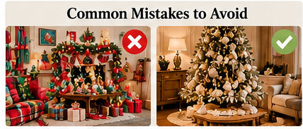
Common Color Scheme Mistakes
- Too many colors: Five or six competing colors rarely look cohesive.
- Mixing several metals: Gold, silver, copper, and brass together can look unplanned unless balanced on purpose.
- Ignoring undertones: Cool reds and warm reds, or yellow and gray golds, can clash.
- Forgetting texture: Neutral and monochrome palettes need varied materials to avoid looking flat.
- Choosing from a photo only: Check ribbon, ornaments, and fabrics in your own lighting before buying in bulk.
Updating Your Colors on a Budget
You can often refresh a scheme without replacing everything. Change the ribbon and tree topper, swap a box of ornaments, wrap existing ones in a new color, or restyle with fabric, garland, and candles. Replacing the cheapest, most visible items first, such as ribbon and tabletop pieces, usually shifts the look the most. At the end of the season, store ornaments by color so next year’s setup is faster.
Frequently Asked Questions
What are some different color schemes for Christmas?
Popular directions include classic red and green, green and gold, white and silver, blue and silver, navy and gold, soft neutrals, blush and champagne, black and gold, burgundy and plum, sage and white, retro aqua and pink, and rustic natural.
What are the top 5 Christmas colors?
Red, green, white, gold, and silver are the colors most commonly associated with Christmas decorating.
What are the 12 Christmas colors in order?
There isn’t a single official ordered list. Different publishers group Christmas colors differently, so use the 12 schemes above as ready-made combinations instead of searching for one fixed order.
What colors are popular for Christmas this year?
Traditional red and green remain common, alongside neutral, blue, and muted green palettes. Preferences vary by household and region, so choose what suits your room and finishes rather than following a single trend claim.
How many colors should a Christmas tree have?
Three colors plus one metal finish is a reliable starting point, because it keeps the tree cohesive while leaving room for texture.
Do I need to match my Christmas colors to my living room?
Not exactly, but they should sit comfortably next to your walls, floors, and furniture. Warm rooms usually favor warm palettes, while cool rooms usually favor cool ones.

Ethan Miller
Ethan Miller writes about home improvement, interior design, cleaning, and everyday living at Home & Living Daily. He shares practical tips and simple ideas to help readers create more comfortable and functional homes.