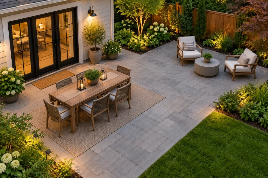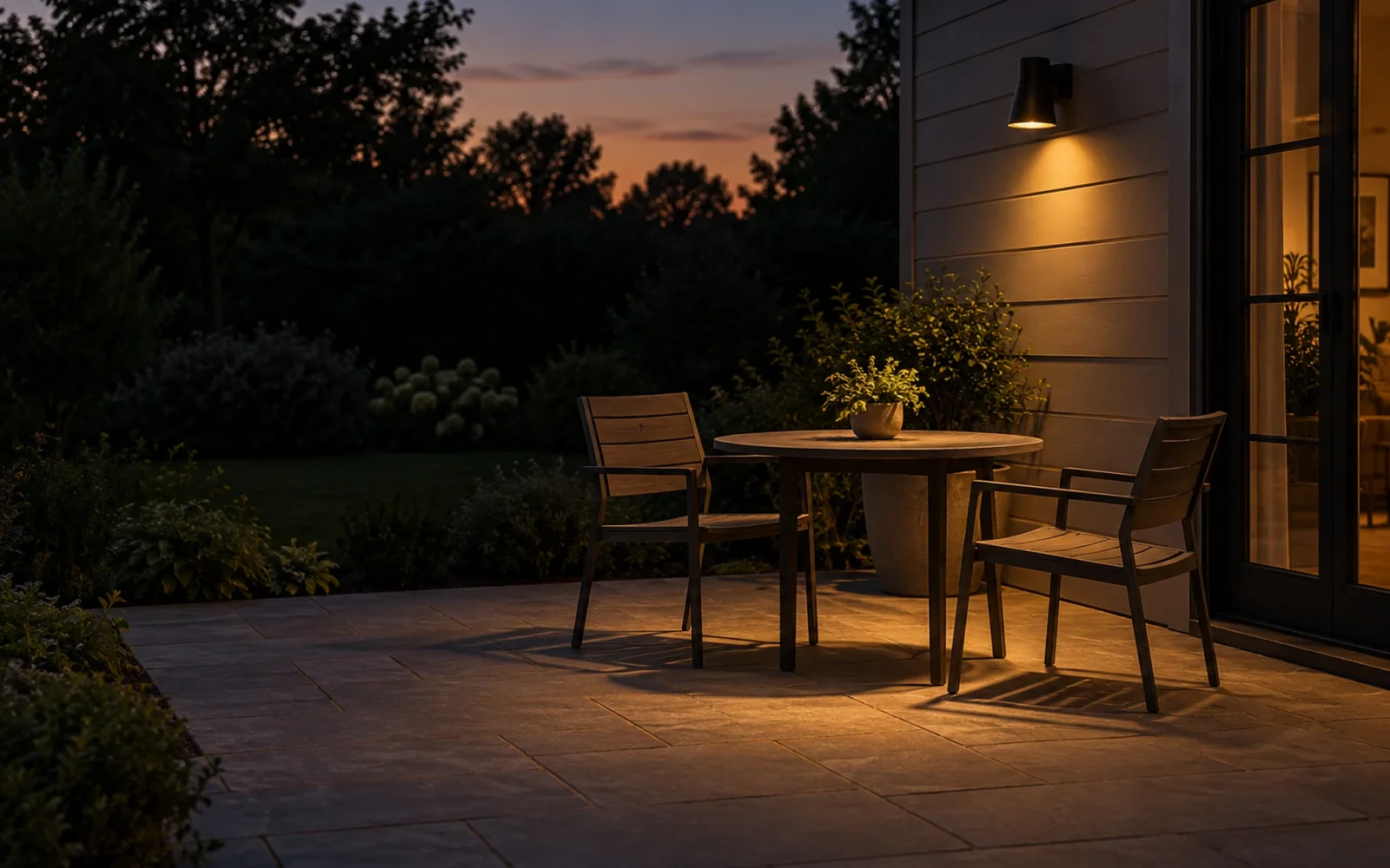
For most home patios, porches, and garden paths, start by looking at warm-white lighting around 2700K. Choose a lower color temperature or an appropriate amber option where a softer appearance or sensitive nighttime setting calls for it. A 3000K lamp may also suit a particular task, but cooler-looking light is not automatically more useful or safer.
Color temperature describes the appearance of white light. It is separate from brightness, beam direction, and colored decorative lamps. Choose those features together rather than expecting one kelvin number to solve the whole lighting plan.
Read kelvin separately from lumens
A lower correlated color temperature generally looks warmer and more yellow or amber; a higher one looks whiter or bluer. The number does not describe how hot the bulb feels or how much electricity it uses.
Lumens describe light output. A 2700K lamp and a 4000K lamp can have the same lumen rating while looking noticeably different. If you want less output, choose fewer lumens or an appropriate dimming system instead of only changing color temperature.
The FTC’s Lighting Facts explanation separates light appearance, brightness, and energy use on bulb packaging. Check the numeric information rather than relying on names such as “soft,” “bright,” or “daylight,” which can be used differently across product ranges.
| White-light appearance | Where to consider it | What to check |
|---|---|---|
| Around 2200K or a suitable amber option | A deliberately warm setting or a sensitive nighttime location | Whether the color still supports the task and any local or ecological requirements |
| Around 2700K | An initial choice for residential paths, entrances, and relaxed seating | Shielding, useful output, and appearance against the actual materials |
| Around 3000K | A somewhat crisper warm-white appearance where suitable | Whether the change adds useful visibility rather than unwanted contrast or spill |
| Around 4000K and above | A cooler appearance for a specifically justified application | Why it is needed, how it will be controlled, and its effect beyond the task area |
Match the appearance to the task
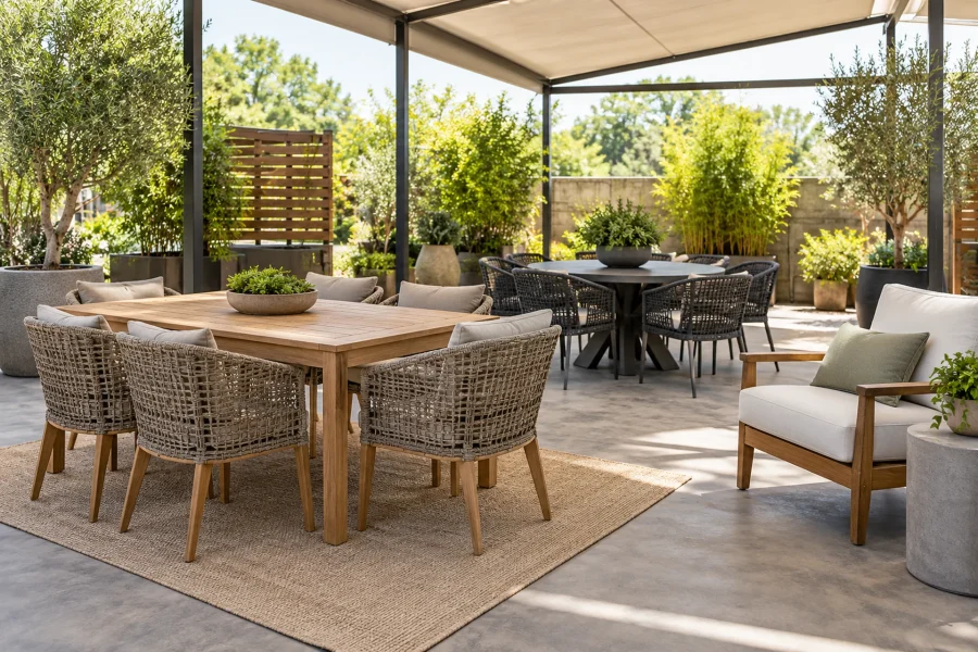
At a dining table, test the lamp while seated. Check skin tones, food, and whether an exposed source is uncomfortable in the normal line of sight. A warm fitting can still produce glare if it is too bright or poorly positioned.
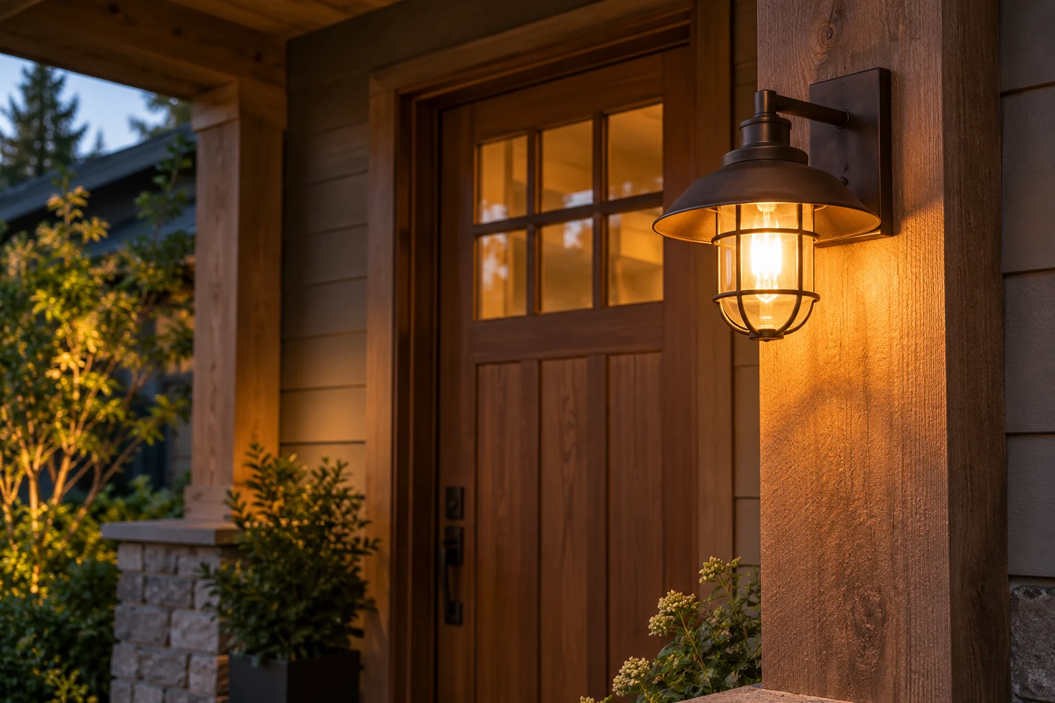
At a doorway, prioritize the threshold, lock, and approaching route. At a path, look for changes in level and a coherent walking surface. If those remain difficult to see, investigate beam distribution and placement before selecting a cooler bulb.
For a work area, compare color rendering as well as color temperature. CCT tells you the white appearance, not how accurately a lamp renders every color. A task involving identification of colored components needs a suitable lighting specification, not simply a bulb marketed as daylight.
Use warmer options without making blanket promises
The National Park Service’s outdoor-lighting principles identify 2700K as a useful warm-white option and suggest 2200K or direct amber for sensitive environments. They also emphasize shielding, minimum useful output, and operating only when needed. The source is guidance for park settings, not a universal residential lighting code.
An amber appearance does not prove a lamp is approved for a wildlife-sensitive site. Some locations require a particular spectrum, fixture, installation, or control. Check the applicable local guidance rather than choosing by appearance alone.
Do not promise an insect-free patio or a health benefit from one CCT value. Warm light still affects the nighttime environment, especially when it is excessive, unshielded, or left on unnecessarily.
Separate white-light choice from colored decoration
Red, blue, green, and RGB decorative settings are not selected on the same simple warm-white scale. They can be useful for a temporary display, but they may change how steps, plants, faces, and objects look.
Keep dependable route lighting available during a decorative display. A colored porch bulb should not be assumed to communicate a universal message; meanings vary and may be unrelated to the practical lighting task.
Check compatibility and judge a sample after dark
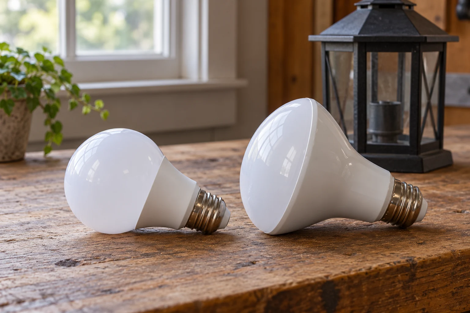
Choose a bulb suitable for the fixture’s base, actual wattage limit, enclosure, outdoor exposure, and control system. A compatible color temperature does not establish wet-location suitability or dimmer compatibility.
Where a fitting has a selectable CCT, use its prescribed switch-off and adjustment procedure. Do not open a powered fixture to change a hidden selector. Record the chosen setting so adjacent lamps can be matched later.
Try one suitable lamp before replacing a whole group. View it from the patio, entrance, indoors, and the neighboring boundary. A consistent appearance can help a small garden feel coherent, but the useful result still depends on what is lit, where the light goes, and when it runs.

Ethan Miller
Ethan Miller writes about home improvement, interior design, cleaning, and everyday living at Home & Living Daily. He shares practical tips and simple ideas to help readers create more comfortable and functional homes.