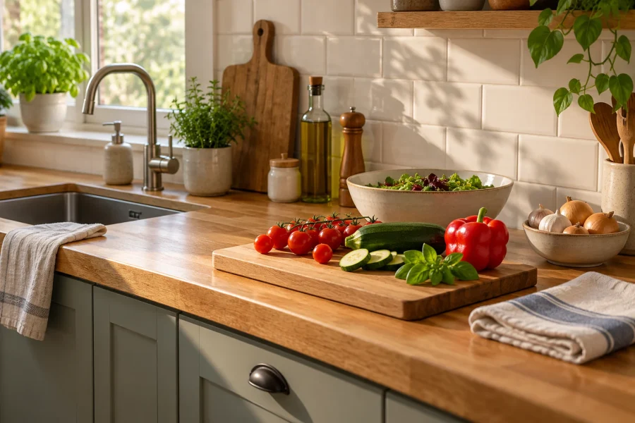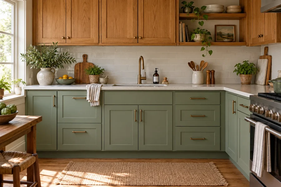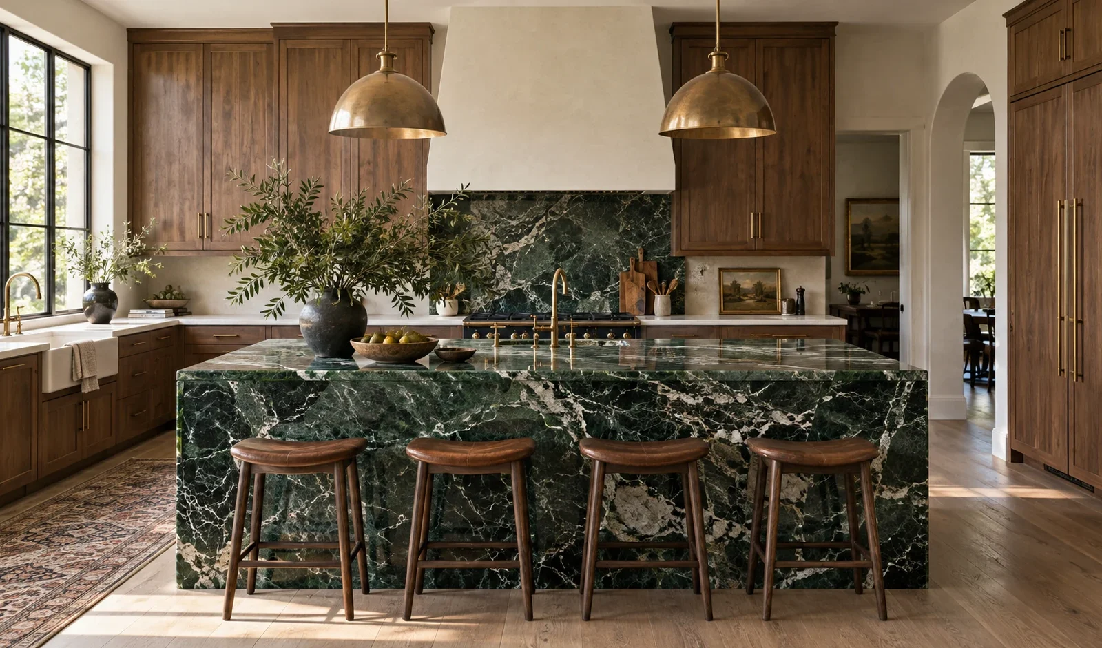
Rich-colored marble covers two related looks: stone with a saturated background, such as deep green or burgundy, and lighter stone marked by dramatic color, such as cream marble with purple veining. Recent designer commentary and published kitchens show growing interest in both directions alongside classic white and gray. This guide explores seven ways to use expressive marble, from a single statement island to a coordinated counter-and-backsplash installation. It also explains how to evaluate cabinet pairings, light, slab variation, maintenance, and fabrication before choosing a stone.
Rich-Colored Marble Kitchen Trends at a Glance
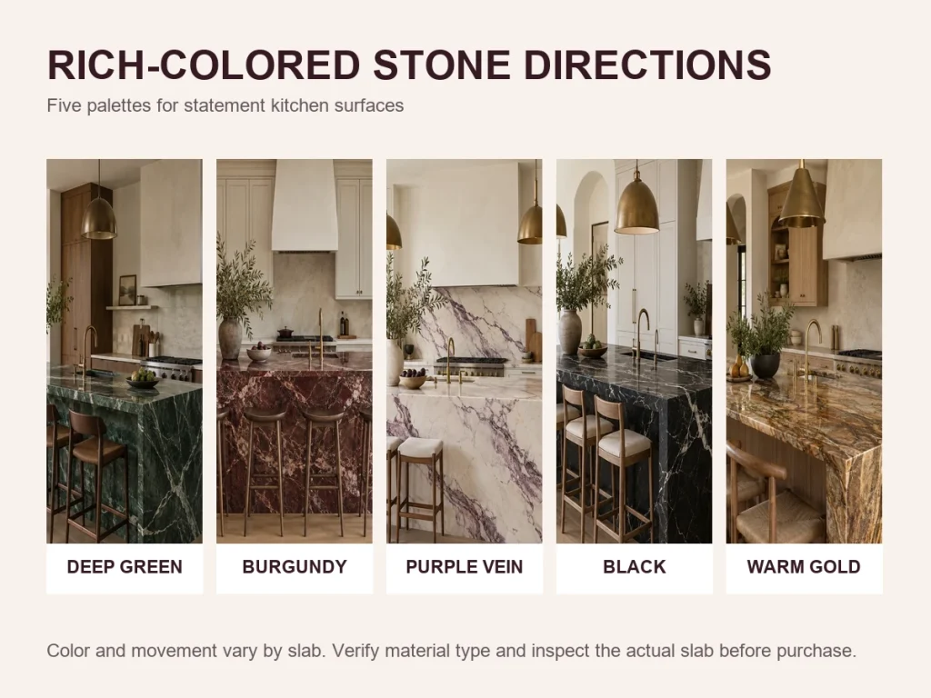
The first five ideas focus on color and veining. The final two focus on how the stone is used. Treat these pairings as starting points: the same slab can feel restrained in one kitchen and dominant in another depending on its scale, lighting, and surrounding finishes.
| Design direction | Suggested pairing | Where to use it | Main trade-off |
| Deep green marble | Tonal green, warm oak, or walnut cabinetry | Island or backsplash | Strong stone and cabinet patterns need visual balance |
| Burgundy marble | Cream or wood cabinetry with restrained metal finishes | Island or limited backsplash | Dark color may hide some marks without preventing stains or etching |
| Cream marble with purple veining | Simple cabinetry and dark timber accents | Island, backsplash, or hood surround | A small sample cannot show the full slab pattern |
| Black marble with light veining | Light cabinetry, wood, and layered lighting | Island or backsplash | The effect depends heavily on light and surface area |
| Warm brown and golden marble | Cream, walnut, oak, or muted painted cabinetry | Countertop or backsplash | Undertones can shift under different lighting |
| Statement island with quiet perimeter | Two coordinated but visually distinct surfaces | Island as the focal point | Edges, seams, and transitions add design and fabrication decisions |
| Coordinated counter and backsplash | The same stone or carefully selected companion slabs | Range wall or full backsplash | Layout, seams, slab size, and waste affect the result and price |
7 Rich-Colored Marble Kitchen Trends for 2026
These directions are a practical way to organize the strongest looks appearing in recent kitchen coverage. They are not a ranking of popularity. Use the examples to understand proportion, pairing, and placement before comparing actual slabs.
1. Deep Green Marble with Tonal or Wood Cabinetry
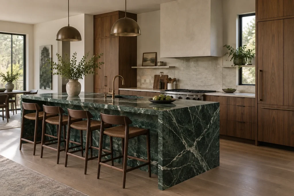
Deep green marble can act as a contained accent or establish the palette for the entire room. A Roundhouse kitchen published by Livingetc pairs a Verde Fantastico island surface with sage-painted cabinetry and Calacatta Monet on the rear wall. The project demonstrates a tonal approach: the cabinetry repeats a quieter version of the stone’s green, while the lighter rear surface prevents the room from becoming visually dense.
Warm oak or walnut offers a different route. Wood introduces a softer grain and can keep a green slab from feeling cold, but the amount of pattern matters. If the floor, cabinet fronts, and stone all have pronounced movement, simplifying one of those surfaces usually produces a calmer composition. Use green marble on an island when you want one clear focal point; carry it onto a backsplash only after checking how the color reads in daylight and evening light. Verde Fantastico, Verde Alpi, and Verde Guatemala are trade names associated with different appearances, so confirm the material category and inspect the actual slab instead of selecting from the name alone.
2. Burgundy Marble as a Kitchen Focal Point
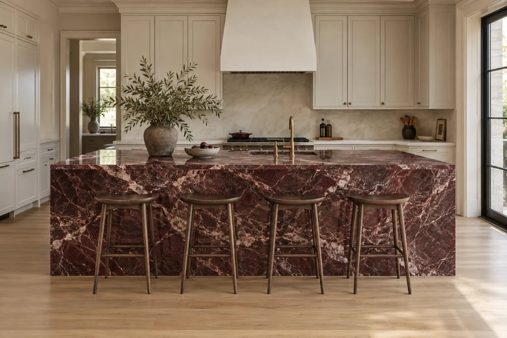
Burgundy marble can have a wine-colored background with pale veining or appear as red and plum movement through a lighter slab. Rosso Levanto is a familiar example of the first look. In a project discussed by Homes & Gardens, designer Susannah Holmberg treats the deep red as a brown-like grounding color, which helps it sit comfortably beside warm neutrals and wood.
Burgundy is especially effective on an island because the color reads as intentional without occupying every work surface. Cream cabinetry can create a quieter background, while dark wood produces a more layered, enveloping palette. Brass or aged bronze can repeat the stone’s warmth, although hardware should remain secondary to the slab. A darker background may make dirt or rings less noticeable, but it does not make marble resistant to staining or acid etching. If you add another saturated color, compare full-room samples so the marble remains the planned focal point rather than one of several competing statements.
3. Cream Marble with Bold Purple Veining
A kitchen does not need a dark countertop to qualify as richly colored. Cream or white marble with purple, burgundy, or plum veining can provide just as much visual impact. Calacatta Viola is widely used as a reference for this look. In Livingetc’s 2026 marble coverage, designers pair expressive purple veining with restrained cabinetry and dark timber, allowing the stone to carry the movement in the room.
Pattern scale is the main decision. A small sample may show an attractive patch of color while missing the wide white areas, concentrated veins, or brecciated sections that define the full slab. View the exact slab and ask the fabricator for a layout drawing showing seams, cutouts, and the most visible areas. Simple cabinet fronts help a busy pattern read clearly; walnut or another dark wood can echo the depth of the purple without copying it. Commercial names and appearances vary, so do not assume every slab labeled Calacatta Viola will reproduce a photographed kitchen.
4. Black Marble with High-Contrast Veining
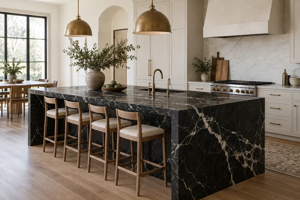
Black marble creates drama through contrast rather than color variety. Negro Marquina, often sold commercially as marble, is known for an intense dark background with irregular white calcite veining. A manufacturer’s technical description classifies the stone lithologically as a limestone, which is a useful reminder that trade categories and geological classifications do not always align perfectly.
In a kitchen, the surrounding surfaces determine whether black stone feels crisp or heavy. Light cabinetry increases contrast; wood adds warmth; layered lighting helps the veining remain visible after sunset. A compact kitchen is not automatically unsuitable for dark marble, but the amount of stone, available daylight, and reflectivity of nearby finishes matter more than a simple room-size rule. Acid etching is chemical damage to the stone’s surface finish. It is different from cracking or structural failure, but it can still be visible and may require professional refinishing. Review both daytime and evening project images before committing to a large black surface.
5. Warm Brown and Golden Marble Palettes
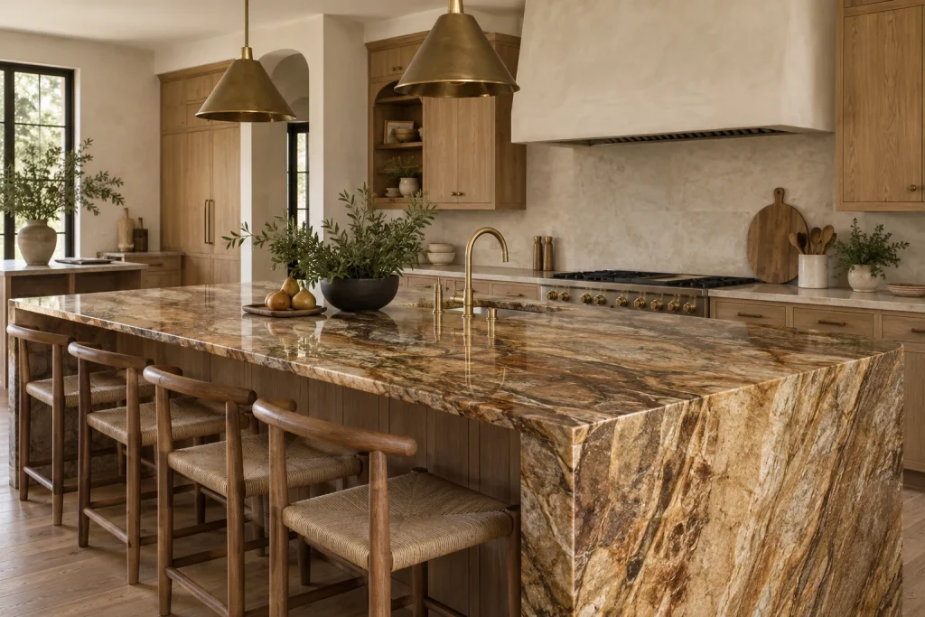
Warm stone is moving the conversation beyond cool gray. Designers quoted by Livingetc point to creamy bases, honeyed undertones, and stronger yellow or gold notes. These descriptions cover two different effects: marble with a brown, caramel, or honey background, and lighter marble crossed by gold veining. The first tends to envelop a room; the second can brighten it while maintaining a lighter overall palette.
Both approaches work well with natural oak, walnut, cream-painted cabinetry, and warm metal finishes. The important step is to compare undertones rather than rely on a color label. A golden vein may look warm in daylight and unexpectedly orange or muted under an artificial bulb. Place the stone sample beside the actual cabinet door and flooring, then view the combination throughout the day. Before naming a slab in the final design, confirm whether it is marble, quartzite, limestone, or another natural stone. Showroom groupings and trade names sometimes emphasize appearance more than geological classification.
6. Statement Marble Islands with Quieter Perimeter Counters
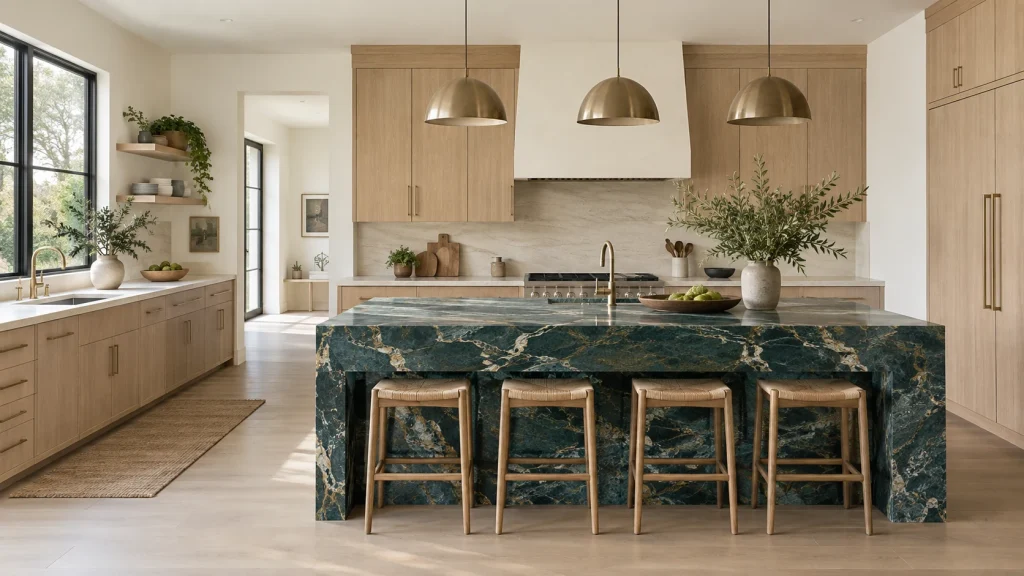
A statement island allows an expressive slab to become the visual center without repeating it across every work surface. The perimeter counters can relate to the island by sharing its background color, picking up a quieter vein, or simply remaining neutral enough to let the island lead. The two surfaces do not need to match, but they should look intentional when seen in the same room.
This approach can also support different functional priorities. A household may choose the perimeter material for frequent preparation and select the island for visual impact, but that decision should be based on the specific materials and how each area is used. Mixing surfaces is not automatically less expensive. Separate slab requirements, edge profiles, thicknesses, seams, and transitions can add fabrication decisions and cost. Ask the fabricator to show both materials on the same layout and confirm how adjoining edges will meet before approving the order.
7. Coordinated Marble Countertops and Backsplashes
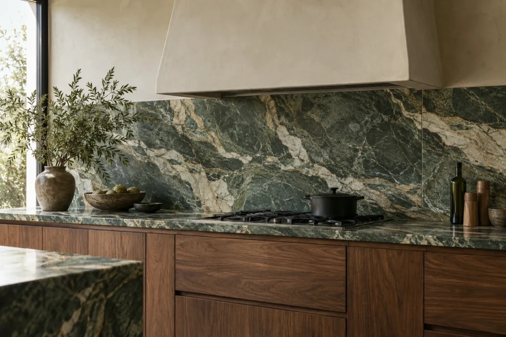
Carrying the same stone from the countertop onto the wall creates continuity and gives the veining more room to read. The installation may use different pieces from the same slab, companion slabs from the same bundle, or separately selected slabs with compatible movement. Confirm the actual cutting plan before describing the result as one continuous slab.
Material continuity, vein alignment, and bookmatching are different. Vein alignment positions adjacent cuts so the movement appears to continue. True bookmatching uses sequential slabs opened like a book to create a mirrored pattern. Not every coordinated installation is bookmatched, and not every slab has a pattern suited to that effect. Full-height backsplashes also increase the importance of slab dimensions, outlets, range openings, seams, and waste. Request a scaled layout drawing and review the most visible cuts before fabrication. A well-planned installation can feel architectural, but a perfectly invisible seam should not be assumed.
How to Choose the Right Colored Marble for Your Kitchen
Start with the Finishes You Are Keeping
Begin with the elements that will remain: flooring, cabinets, wall color, and appliance finishes. These fixed surfaces narrow the range of stone colors and patterns that will work. Warm wood flooring may support a brown, burgundy, or gold-veined slab, while a cooler stone can create deliberate contrast if another finish connects the palette. Use the existing room as a filter, not a rigid rule, and build a shortlist before comparing full slabs.
Choose One Main Focal Point
Decide whether the island, backsplash, or a coordinated counter-and-wall installation will carry the strongest stone. Let the other surfaces support that decision. Daily habits matter: frequent cooking, entertaining, and tolerance for patina or etching should influence where marble is placed. The goal is not to avoid bold stone, but to put it where its visual impact and maintenance requirements suit the household.
Compare Samples in Your Own Lighting
View stone, cabinet, flooring, paint, and hardware samples together in the kitchen. Check them during the day and under the bulbs used at night, since warm and cool undertones can change noticeably. Samples help narrow the palette, but they cannot show the distribution of color across a full slab. Review the actual slab and fabrication layout before placing the final order. Digital renderings are useful planning tools, not guarantees of real-world color.
What to Check Before Buying Colored Marble
Confirm the Material and the Actual Slab
Trade names do not always communicate a stone’s geological category. Ask the supplier for the material classification, origin, dimensions, available quantity, and photographs of the exact slabs. Azul Macaubas illustrates the distinction: its blue color and flowing movement can resemble dramatic marble, but Antolini classifies it as natural quartzite. Quartzite forms when sandstone is transformed by heat and pressure; it is not a variety of marble. Even slabs sold under the same name can vary, so approve the specific material intended for the project.
Understand Finish and Maintenance
Polished marble has a reflective finish, while honed marble has a flatter, matte appearance that may make some wear less conspicuous. Neither finish makes marble stain-proof or etch-proof. Staining occurs when a substance is absorbed into the stone. An appropriate penetrating sealer may reduce absorption, but it does not create an invulnerable surface. Etching is a chemical reaction between acid and calcite that dulls or changes the finish. Follow the supplier and fabricator’s guidance for the selected slab, finish, cleaner, and sealer rather than applying one schedule to every marble.
Review Fabrication and the Full Quote
A complete quote should separate or clearly identify the slab, fabrication, delivery, installation, edge profile, sink and cooktop cutouts, seams, reinforcement, and expected waste. Ask for a layout drawing when the pattern is a major reason for choosing the stone. When comparing prices, check the location, date, unit of measurement, and whether fabrication and installation are included. Slab rarity, required quantity, pattern matching, edge details, access, and local labor can matter more than a broad national price estimate.
When to Consider a Marble-Look Alternative
Compare alternatives when the appearance of richly colored stone appeals to you but your priorities call for a different maintenance profile, pattern consistency, or fabrication approach. Natural quartzite is a metamorphic stone and can be harder than calcite-based marble, but porosity and performance vary by slab. Engineered quartz is manufactured from mineral aggregate and resin; its stain and heat performance depends on the specific product. Porcelain slabs use manufactured surfaces and printed or through-body designs, with edge, support, and fabrication requirements that also vary.
No category is automatically maintenance-free, stain-proof, scratch-proof, or chip-proof. Review technical information for the exact product, test samples when appropriate, and compare how seams and edges will look. If natural variation is central to the design, remember that a printed marble pattern and a natural slab provide different visual experiences even when the colors are similar.
Frequently Asked Questions
Can rich-colored marble work in a small kitchen?
Yes, depending on the amount of stone, available light, pattern scale, and surrounding finishes. A compact kitchen may use a bold slab on one backsplash or short counter run rather than every surface. Review the full-room effect instead of applying a blanket rule about dark colors.
Should the island and perimeter countertops match?
They can match, but they do not have to. A mixed scheme can feel cohesive when the surfaces share an undertone, vein color, or level of visual movement. Decide whether you want a continuous backdrop or a clear focal point, then compare both materials together.
Will colored marble make a kitchen look dated?
No material can guarantee a permanently current look. Choose a color and pattern that suit the home’s architecture and your long-term preferences, then control how much of it appears in the room. Do not rely on a trend label or assume the material alone will increase resale value.
Can I choose a marble slab from a small sample?
A sample helps compare color, finish, and general character, but it cannot show the full slab’s variation. Inspect the actual slab whenever possible and review a layout showing seams, cutouts, and visible pattern placement before fabrication begins.
The best rich-colored marble is the one that works with your kitchen’s light, layout, existing finishes, and daily use. Shortlist two directions, compare real samples with the cabinet and flooring materials, and decide where the stone should become the focal point before approving the slab and layout.

Ethan Miller
Ethan Miller writes about home improvement, interior design, cleaning, and everyday living at Home & Living Daily. He shares practical tips and simple ideas to help readers create more comfortable and functional homes.